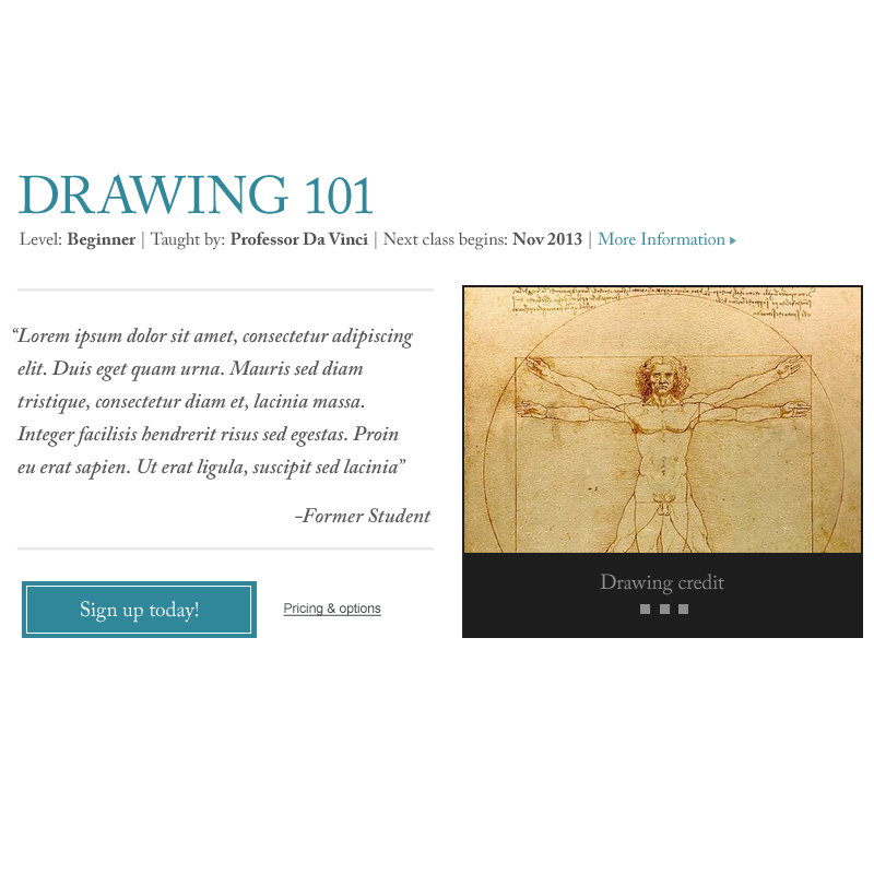
This is a problem I’m having to figure out for a project – how to convey a bunch of information for a class (student review/response, student work, sign up button) in a space that won’t take up a whole page to either get someone to click through to more information, or even better, to just sign up. I’m hoping here that the past student review and student work will speak for itself.
Not quite sure about the sign up button placement though…

